Under the (Ray) Gun: Chris Ashworth

Interview by Travis Ritter, artwork by Chris Ashworth, WIP photography by Chaz Laughlin
Regarded as much for its adventurous taste in music as for the unapologetic and unorthodox liberties its art directors took, the 1990s print publication Ray Gun was the most eye-catching, explorative and downright irreverent magazine of its time.
Case in point, the original Ray Gun art director, David Carson, once found a Bryan Ferry interview so boring, he designed the piece with the indecipherable Dingbats font so no one could read it. But this feature isn’t about David Carson—or Ray Gun, for that matter. This is about Chris Ashworth, a British designer who came to Ray Gun as art director in 1997 and gave birth to a new aesthetic he calls Swiss Grit—a sharp and contemporary experimental typographic style (exemplified by the cover he designed for this issue), and a forthcoming book by the same name. Balancing work, family and creative life is no easy task, but after thirty years of design, Ashworth has finally hit his stride and has plenty left to do. Seeking insight into his past, present, and future, I caught up with Ashworth across the water from Seattle, at Microsoft’s Redmond campus headquarters, where, for the last decade, he’s managed a team of designers who occasionally have to show him how some things are done on the computer.
How did you land your role as an art director for Ray Gun?
So that was ‘97. I studied ‘89 and ‘90 in York in the north of England, where I took my first typography course. As I was finishing that, I started to see Beach Culture and Emigre magazine coming out of the States. At the same time, there was a lot of pretty experimental type coming out of London at all these smaller design studios. Design at that point was much more traditional. My work was a fusion of the Swiss stuff I was influenced by in college, and all this American stuff, which was much freer and breaking the rules. From ‘91 to ‘97, I was not making any money at all, but having lots of typographic fun. I worked for myself with a couple of friends after college doing club flyers and such. I got a job at Eg.G in Sheffield, which is a small studio down the street from The Designers Republic.
Designers Republic designed some of my favourite albums!
Totally! There were only four of us at Eg.G. The other designer came from The Designers Republic, so we used to trade stories. In ‘93, I did a personal project with a photographer who got in touch with me to work on a book, and I worked with one of the designers from Designers Republic on the sleeve. His boss and my boss never knew about us working together in the evenings. Then in ‘94, I quit and moved to London. Myself and the guy I’d been working with in Sheffield went to work freelance at MTV for eight months.

What were you doing there?
We did the 1994 MTV Music Awards promo. Anton Corbijn was directing the show. He was one of my heroes because I’m a massive Depeche Mode fan. We worked on the promo, the advertising and awards brochure. After that, another friend from college and I set up a studio called Substance.
Named after the Joy Division compilation?
Exactly. That’s when we started making a name for ourselves in London. We did a cover for Creative Review, the UK design magazine. Marvin Jarrett, who ran Ray Gun, got in touch with the editor of Creative Review, saying he wanted to launch a music magazine in London, and asked if he could recommend any designers. So he gave Marvin our names as well as some other studios, and we all started pitching ideas. We won that pitch. That’s how Blah Blah Blah came about. It was a partnership that Marvin had with MTV. We did it for five issues before it went sideways. That’s when we started working on this Ray Gun book. At the end of ‘96, Marvin asked if I wanted to move to LA and do the magazine. It all came by word of mouth. I always find that’s the best way, letting the work progress naturally.

What tools were you working with?
QuarkXpress. But every time I did an issue, I would start again. I didn’t have any grids or templates or anything. The one thing I wanted to do was make it this hybrid of freeform with a Swiss aesthetic. I wanted to bring a bit more of the European design influence to it, while still keeping some of the raw, natural sensibilities that I loved about Ray
Gun. I just set about trying to work my way through. If you look at the fifteen issues that I did, it’s interesting. The first few are more Blah Blah Blah-y, and then I got more into this Swiss aesthetic, blended with this gritty, more freeform kind of style. By four or five issues in, I started to get to a space where I felt like I was doing something fresh and interesting.
And you were there for two years?
Eighteen months. Fifteen issues.
Fast forward to now, where you’ve been at Microsoft for ten years.
Uh-huh. And I was at Getty Images for eight years before that. So I spent eight or nine years being a very experimental designer, and I’ve since spent over twice that in the corporate world. It’s weird, but I find it as interesting as the other stuff. It’s interesting developing creative when you’re not just on your own. I can see both sides of it. In the last three years, I’ve basically rebooted my own personal stuff. I have seven-year-old twins—Syd and Sen: budding young typographers—so it has taken me awhile to do this and that. Now that they’re a little bit older, I can get back into my personal stuff again.


So none of what you’ve done at Microsoft design-wise is reflective of what you’ve done in the past with experimental design?
Not aesthetically, but the way I think about things and my influences feed into that. We just did our biggest consumer event last week, and the promo for it was essentially inspired by Wim Crouwel, the Dutch designer. So I bring in these experimental design influences, but most people haven’t got a clue where they come from. To them, it just looks fresh and exciting and contemporary.
When you look at magazine design today, what stands out to you?
I don’t really look at it. I used to religiously. I don’t know if you’ve seen my Instagram feed, but I get much more excitement and gravitate more to being outside and looking at things, finding things. I used to go through books and magazines and get everything as it came out and soak it all up, but now I’m like…
Admiring weather-worn signs pulling apart from a building?
Exactly. I haven’t done it deliberately, I’ve just gravitated toward it. I get my inspiration from things that I find when I’m just going about walking my dogs. I’m trying to do my own book, so that’s my thing now. I’m up to like, page 950.

Are those little square forms you’ve been posting for the book?
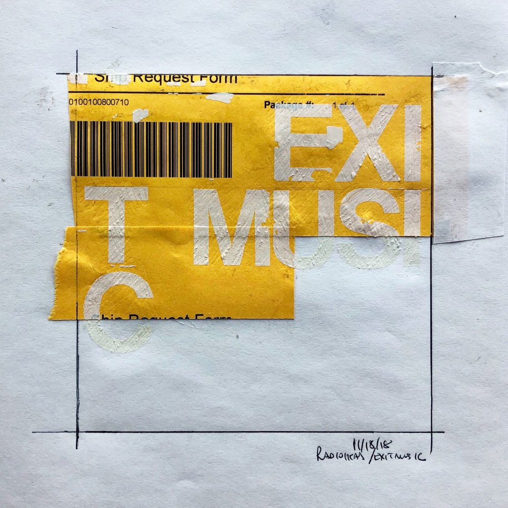
Yeah, that stuff will be in the book, but that’s just me. I started doing this thing called ‘From The Archives’, showing all my old work, and then I started messing around again, sticking bits of paper together. I think I posted without really thinking much about it, and I called it ‘Not From The Archive’. So, I like this idea of showing my past but actually creating some new stuff as well.
You still work in a very old school way.
Uh-huh.
You don’t like working with computers at all?
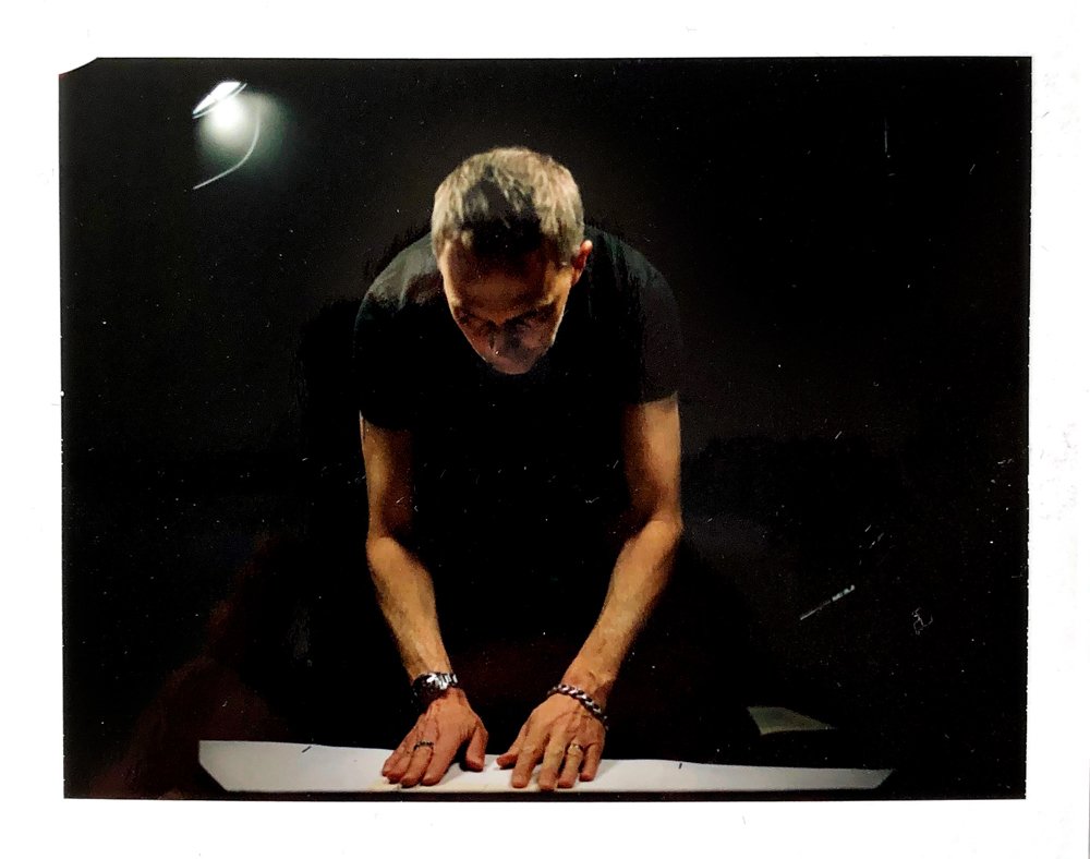
Nuh-uh. I’m trying to do my book and work in InDesign—it’s a nightmare. My designer showed me how. I got a grid, which I drew out on paper, and then we created a grid onscreen. I know the key commands to drop the image in; that’s as far as I’ve gotten. I’m flooding this book with images, and then, around Christmas, I’m going to start putting the type in. I have to learn how to set type all over again after thirty years. Who knows what it’s going to be like?
Do you think the hands-on approach is missing in a lot of design today, where almost everything is created on a computer?
Yeah. I did this talk about a year ago, and the theme was craftsmanship. Again, I never think too much about what I’m doing, but this made me really think about it. I kind of arrived at this thought that I’m trying to bring some feeling and some emotion to what I’m communicating. And I think the trick today is finding ways of doing that. That’s why when I’m outside, it’s all the imperfections that attract me. Like when you see a sign: at one point, it looked sterile and crisp, just like when you typeset something on a screen. But over time, it takes on a life of its own and starts to have a soul and feel unique. And that is what interests me.

What advice would you give to new designers?
Do you know Malcolm Garrett? He designed all the Buzzcocks and Duran Duran records. Anyway, he curates a theme-based exhibition in the north of England. He asks designers to respond to a brief and shows the responses for the exhibition. The brief this year was to reinvent the famous list of art school rules written by this nun in the ‘60s [10 Rules for Students, Teachers, and Life by Sister Corita Kent and John Cage]. So, my rule: Just Doodle. To answer your question, get off the computer and use one of these (*taps my notebook). You just get so many interesting ideas. It’s inspiring. That would be my advice: doodle.
Check out more from Chris Ashworth, here.