If Hollywood Don’t Need Us
Interview by Kate Williams.
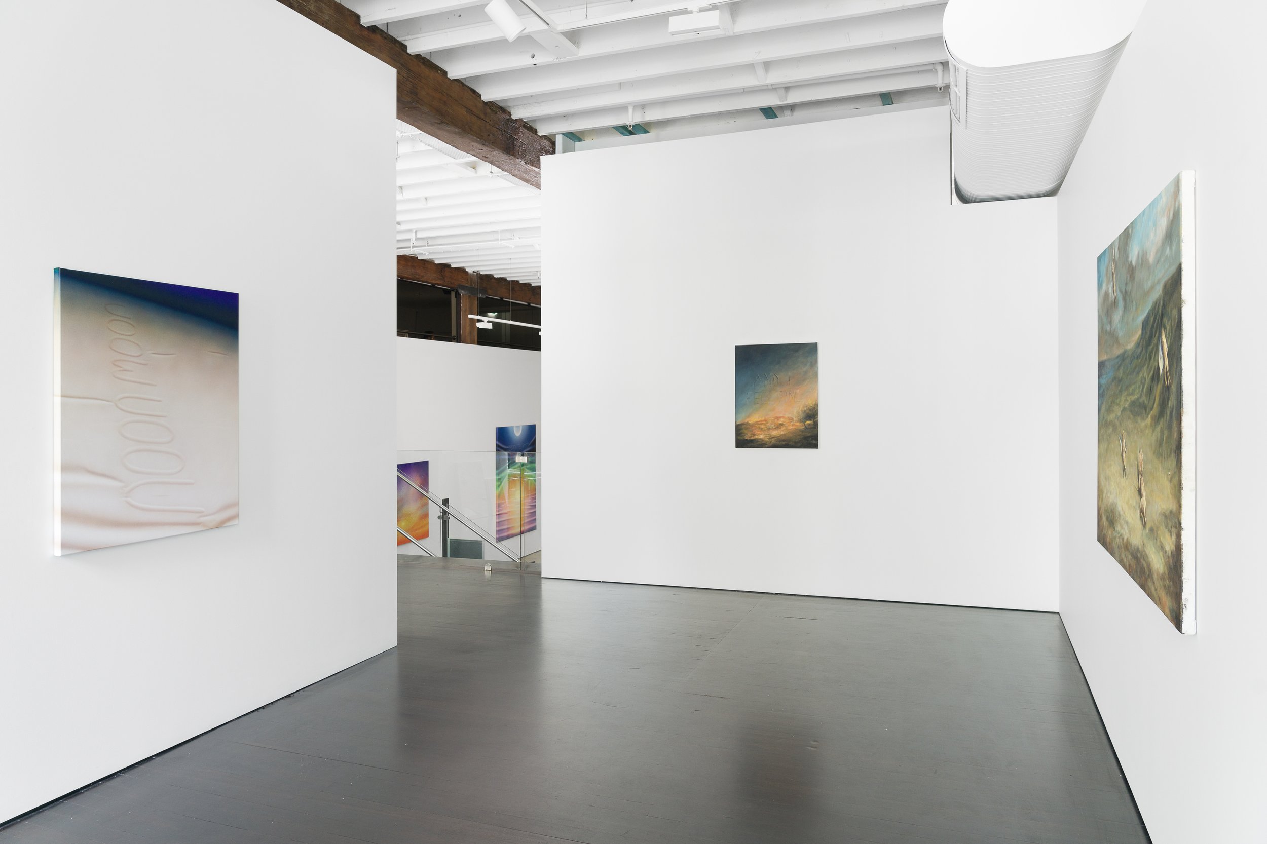
If Hollywood Don’t Need Us opened March 14th at Piermarq and showcases the work of Preston Daniels and Jeremy Shockley, two southern born, Los Angeles-based artists who share a studio, a color palette and guardianship of several backyard chickens.
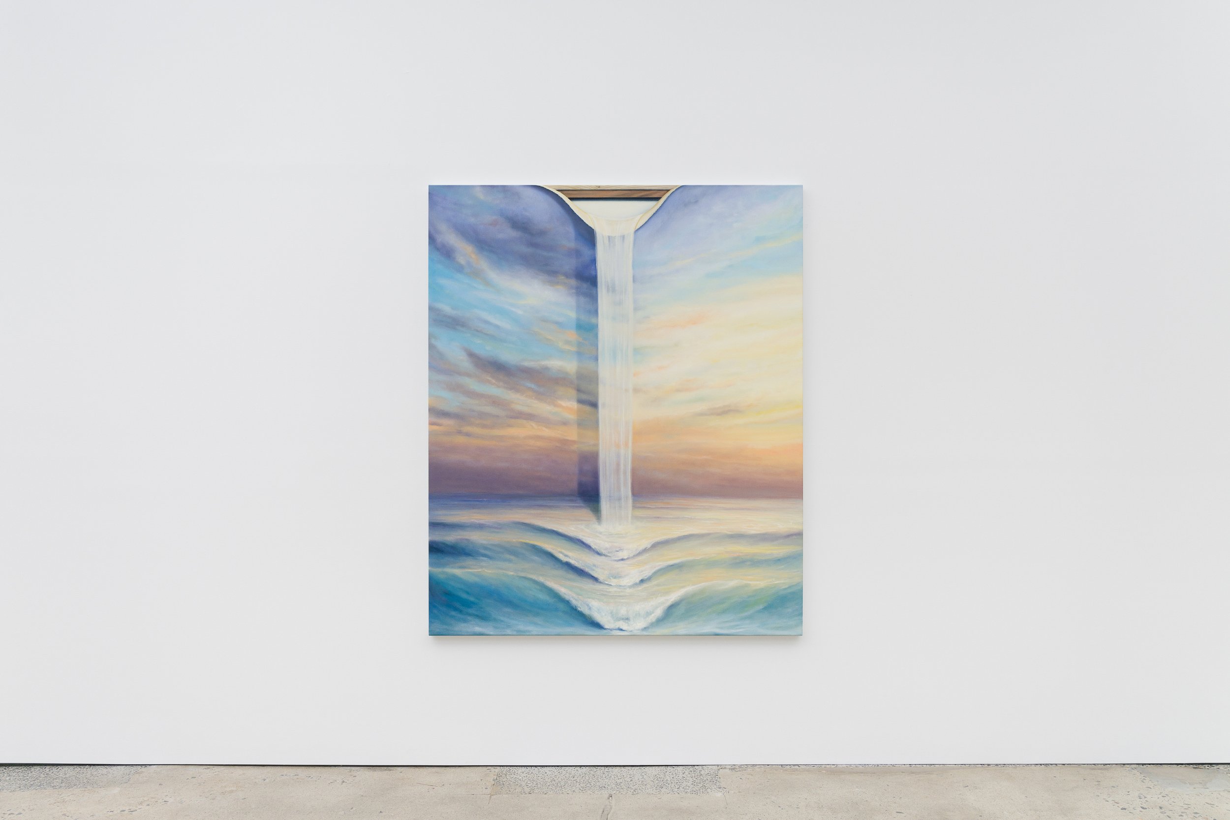
Longtime behind-the-scenes veterans of the art world—Daniels was Richard Jackson’s studio assistant, and Shockley worked for Gagosian, Chris Burden and Tom Sachs—both artists maintain an outsider’s perspective on a world they are very much in, and this sense of rebelliousness shows up in their paintings. So much of art, and of life, is about ugliness, decrying it while mirroring it every which way, and Preston and Daniel’s work, from the vivid hues to the in-on-the-joke elements of surrealism and magical realism, takes on the much more interesting challenge of finding beauty in the mess. It prods the viewer to experience joy and maybe, just maybe, even smile.
The show takes its name from a Don Williams song, “If Hollywood Don’t Need You.” How does that relate to this show?
Jeremy Shockley: It just feels like someone moving from the south and their on again, off again, relationship with Hollywood and Los Angeles. It's always like you're trying to figure out if you love Los Angeles or want to leave it. No matter what, I love Los Angeles. But I could leave it, too.
Preston Daniels: Every iconic image of Los Angeles is always dotted with these tall, skinny palm trees and there are no palm trees native to Los Angeles. LA is lush and green but it's also supposed to be a barren desert. And so there's this weird contradiction there that I think is interesting.
Hollywood has given LA a very superficial reputation, but it seems like, especially in the art world, there’s a lot of genuine community here.
JS: In New York, you’re fighting for a place to show and for a studio. There’s more space here, so artists help artists. Someone is interested in your work and you're like, "Have you seen this guy's work too?" Not that that doesn’t happen in New York, but I feel like the competition here is a friendlier competition.
PD: I think that connects to just how young it is here. Ten or fifteen years ago, there was nothing. Downtown was a barren wasteland. There were a handful of galleries, so if you wanted to do shows, you had to do it yourself. There wasn't another option, and the community here has grown out of that.
Both of you work with a lot of color and realistic elements. How’d you arrive at this?
PD: For a while, I made these really large scale black sculpture installations that had intense fluorescent light tubes running through them. After that, I made smaller scale sculptures with bright, vibrant color and a lot of them still incorporated intense light sources. The paintings kind of emerged out of those sculptures. That's where airbrush and spray really lends itself because you can make things really soft and give it the appearance of a dimension.
JS: I think that maybe I got nicer paints? That did help. I've had these short bursts of times where I had to get entire shows done and there's something about having some of these tight deadlines that forces you to make these decisions quicker. My brain goes to brighter colors.
How about the use of words?
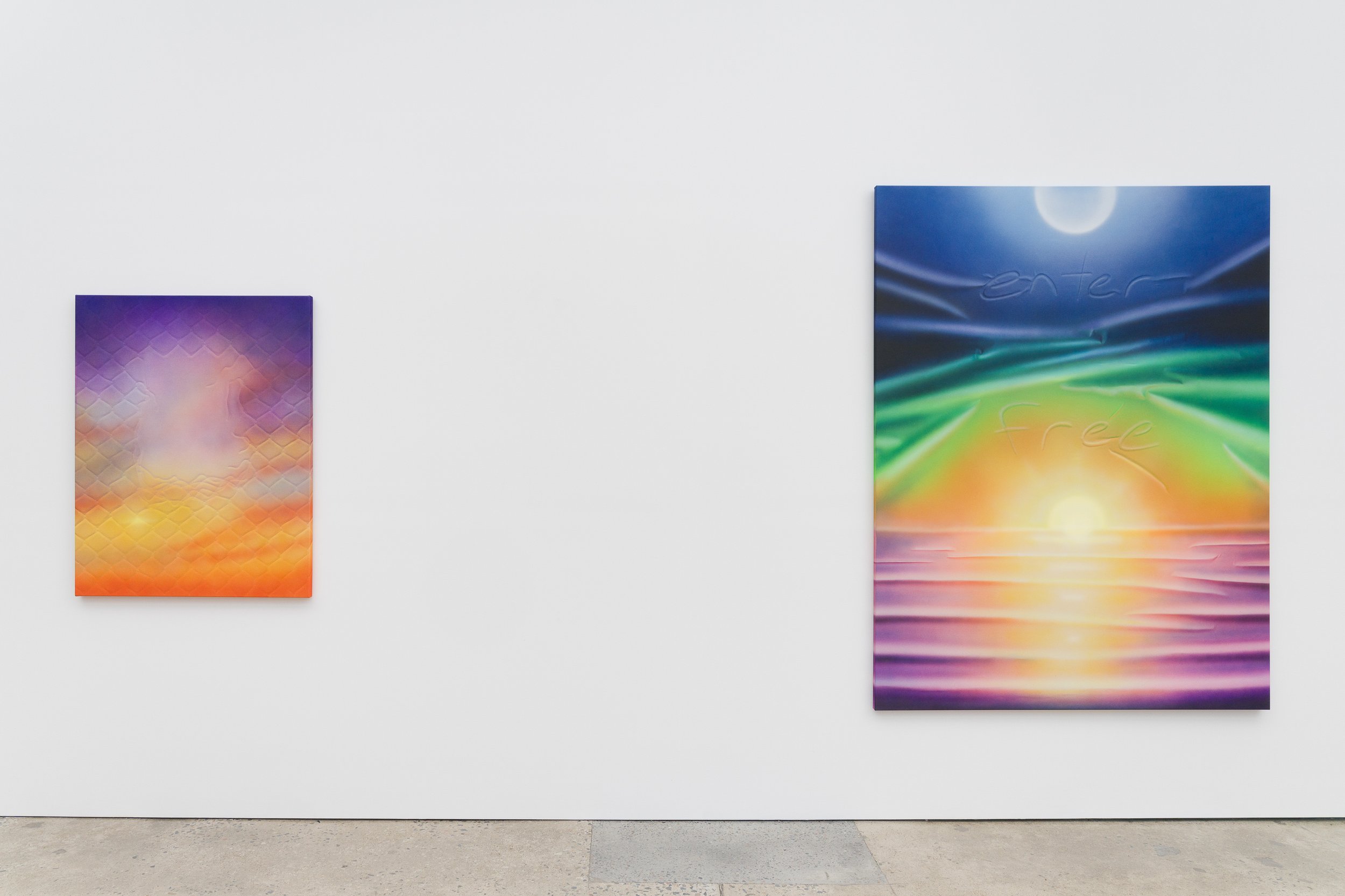
PD: For me, what I find interesting about words in my paintings is that I've always thought of isolated words like abstract images. The text and words come from this desire to create open images that are at the same time specifically referencing something.
JS: I haven't used words a lot in a long time, then I recently started doing these trompe l’oeil cut-in words because I was figuring out ways we could tie our work in for this show. It's nice to be right across the hall from each other so we can see each other working on and then the paintings are all going to exist in the same room, so we wanted to play off ideas back and forth.
PD: What's cool about Jeremy and I is that we are unabashed about learning from each other. I've learned a lot from Jeremy's skies and learning how colors come together and Jeremy picked up on text and our paintings are very different in a lot of ways, but there's both this lean towards illusion or towards depth and dimension when they’re also clearly flat.
JS: We were doing a residency together in Norwich, England, last year and we were both just cranking on these paintings completely separately, but they were the exact same colors. The paintings didn’t look anything alike, but we’d picked the same colors and it was crazy because it was the most California colors you could throw in the Norwich area.
Is your work optimistic? It feels like it.
JS: During the pandemic, everyone was painting portraits and I was like, people are going to be around way longer than pretty skies, so these would be great bunker paintings. Maybe we don't need to just keep capturing people? People are very resilient. We're going to be around forever. We might destroy the world, but we will be here. And the skies, there might be times when you can't just go look at the sky and have a beautiful experience. Paintings can be mostly optimistic, but there's always got to be some kind of undertone of how you're processing the changes in the world around you.
PD: Yeah, my paintings are about optimism. Contemporary art is so focused on cynicism and pessimism that adding some element of joy, however small it is, into that is a good thing and there needs to be more of it. Because it's art. It should be a joyful thing, and we should be able to express that and not feel weird or bad about it.
