An Interview With Interview Magazine Art Director, Kurt Woerpel
Images Courtesy of Kurt Woerpel
Kurt Woerpel makes illustration and typography look and feel punk.
His drawings are loud and urgent. The typography deliberately chaotic. In 2018, Kurt was hired by Interview Magazine as their freelance Art Director. To the untrained eye, one might mistake Kurt’s body of work as carefree improvisation, but the xerox aesthetic of Kurt’s style is deliberate and intent on showing audiences the cracks beneath the surface. Flipping open to Interview’s masthead page, you get the sense Kurt likes to keep his foot pressed down on the sustain pedal, letting the illustrations, images and fonts merge and sound longer then necessary.
Founded by Andy Warhol in 1969, Interview Magazine had long been at the bleeding edge of independent print publication with its striking style and candid, often unedited celebrity interviews. When current Editor-in-Chief Mel Ottenberg was 11 years old, he discovered Interview at the hair salon his mom would frequent in Washington, D.C. “Her hairdresser was horrified that I was reading such filth while getting my hair cut. He told me that Interview was pornographic trash and totally over as Warhol had just died.” Interview folded much later, in May of 2018. A few months later Kurt got the call to work as their Art Director when the magazine was redesigned and relaunched in September.
To flip open a copy of Interview Magazine today is like watching a Safdie brothers’ film – it is urgent and fast and sensorily demanding. The conversations between an eccentric mix of celebrities (Issue 539 featured Miley Cyrus, Jonathan Franzen and Andy Cohen) are refreshingly irreverent and offbeat. Alongside Mel and the team, Kurt has helped Interview restore its incredible legacy of raw glamour while arguing for their own agenda, experimenting with every possible element of magazine making.
Did you know you want to be a graphic designer as a kid?
I was really into Blind skateboards and Toy Machine and the artist who made Toy Machine, Ed Templeton, who is a huge legend. My parents got me a subscription to Thrasher one year. These bodies of work inspired me to think about logos and advertisements in magazines. One of the first times I saw a design ad that was really sick was in Transworld Skateboarding, a Volcom ad that had someone jumping down a huge stair set, this kind of lush collage with the stair set exploding in the background and an iguana peering down from the top. I love zines and self publishing, all these sources of inspiration that are a bit more piecemeal.
You have your own personal publishing project with txt books, what has that been like?
Yeah, it's wild. It's been nearly a 10-year project. It's insane we have been in it that long. Brooklyn is such a large city that it can sustain a lot of different projects, there are so many presses here, its sort of ingrained in the culture. Everyone supports each other and grows in this communal way, where it's like “oh our printer is broken. Like do you know how to fix it?” And someone will have one and tell me to come over. Everyone’s friends.

Art director is such a nebulous job title. What do you tell people you do for work at parties?
The role of Art Director changes so much depending on where you are. I think at some places you might never touch design and your living in a theoretical realm coming up with pitches and ideas. Like people will ask, no, what do you actually do Kurt? At most places now, you ask someone what they do, and they’re probably doing like 2 or 3 different jobs that were once their own individual roles. At Interview, most of the shoots are arranged by our creative director, Mel, who is now the editor-in-chief, and our photo director. We will get 150 photos and we will need to figure out how that fits together. We’ve had stories in the past where we have only one photo that kind of works, and it’s like, what do we do with it to make it feel right. A lot of art direction is problem solving. I am kind of at the back-end side of things with all the design.

There is something so free and urgent about all the design and photographic ideas you merge in Interview. How would you describe your style?
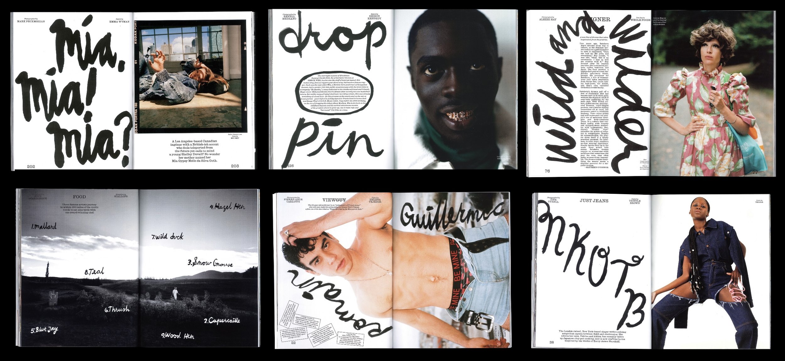
Interview is quite simple in a sense because it is based on running large, beautiful photos of people who are super interesting. It’s about how you pace things out. Each story feels like it has this natural kind of rhythm. Sometimes we might have seven photos and six pages, and we can only use five photos. It’s always a puzzle. Something will eventually click. But I think of my style as organized chaos, having a little bit of chaos peeking out of the corner so you can kind of see that this giant system isn’t so tight as you think. I think this comes from my interest in DIY music and indepdent publications, and I think it lends this amateurish hand at play. I want it to look handmade. It makes it fun. It feels accessible.
Yet when you flip open a copy of Interview, there is a harmony to all this chaos.
The photos are so singular that sometimes we don't want to interrupt them at all. You don't want to over complicate it. And then there's other ones where we put a giant pull quote that says something a little bit jarring. We want it to feel less self serious, like were in on the joke, you know, where it’s like, can you believe this person said this? A lot of magazines have this pressure to present things in a slick format. When I started, I was doing a lot of hand lettering all through the issue and making like custom type treatments. We have tried to change the flavour over top of this core magazine structure over the years.


How do you maintain the freshness of a magazine that is decades old and still honor its history?
Interview has such a rich history to it, there's just so much to mine. Right now, were using this sans serif font and we were inspired by a lot of the 70’s style of interviews where they use a thin sans serif. It feels very immediate. When we started off with the original redesign, which our design director Richard Turley put together, he was trying figure out how you stride that line of embedding yourself within the history of the magazine while also not just doing that exact same thing.
Bringing a magazine back from the dead is a momentous task. What was that experience like? You helped with the redesign of business week, did having that experience help when you were brought on board to Interview?
Business week was basically editorial bootcamp. With Interview, Richard asked me to help with lettering and typeface. We had different studies and ways you could treat the typography and come up with a logo. The editor in chief at the time, Nick Harris, and then Mel, who was brought on as a creative director, they were kind of like, well, what's the design going to be? The initial idea was to bring the lettering from the cover of the magazine back into the magazine itself. Because Interview was in limbo, we didn’t have an office. We went to a place that was a kind of glorified WeWork they were renting. It was basically one big table, and everybody who was involved in the magazine was just sitting at this table.

In most magazines the masthead page is untouchable. You like to scribble on it and put little offcuts of photos a photographer might have taken on set. Who gave you carte blanche to experiment like that?
Over the years we’ve done a bunch of fun stuff with the masthead pages. Like there is one where its literally one giant scribble, or a bunch of smiley faces. I think magazines can be a little precious with their white space. I find people get excited by seeing the process behind the development of the magazine, and the masthead page is a great place to reveal a bit of the process.
How much of graphic design and art direction is improvisation?
The improvisation aspect I think is a really good way to put it, you know, because if you are improvising music, say, you have to respond to what the other musicians are playing. People talk about design as if there is this master plan of knowing exactly how each element is going to interact with each other and everything sliding into place perfectly. If we get photos back that are not very compelling, well, maybe I need to cut the photo in half and run it across two pages instead of one? Oh, this headline doesn't make sense. Maybe we change it to being a pull quote that's gigantic. When I was doing a lot of hand lettering, sometimes it made the story feel more playful or compelling. I remember early on, if something wasn’t working, I would have a bottle of ink and a brush and do twenty versions of the same hand lettering. I would be literally hunched over my desk covered in ink, using paint markers and stencil kit paper just inhaling fumes of oil-based paint to try and get it right. They would ask me to do other stuff and its like, oh yeah, sorry, I just took seven hours writing ‘Parker’.

Mel Ottenberg is an icon in the fashion world. What’s it like working with him?
I work with Mel super closely. It’s so great, he has this philosophy of being very hands on, he’s always telling me ‘If you have an idea, I want to see it.’ He’s so focused and has such a crazy gut instinct for what works and what doesn’t.
Do you ever get worried you might offend a photographer by putting too much typography and design elements over an image? Have you ever pissed a photographer off?
Without naming names, yes. I mean, photographers are obviously sensitive about the images they provide. Every photographer has a different comfort level with what they will accept. It happens with cropping all the time. We have a very awkwardly sized magazine. Sometimes photographers will tell us they want their photos to have two or three inches of white space at the bottom of it. And I am like yeah, have you ever picked up an Interview magazine? We have been super aggressive, you know, type right above their forehead and on their stomach and above their knee. That’s not obviously good for the original intent and weight balance of that photo. Maybe it’s a bit cheeky, but it makes for more compelling visuals.

Are there any spaces you’re looking to move into?
I think most people when they get into art, it comes from being an artist first and then a commercial artist later. I still draw for myself, and it feeds back into other things I am working on.
Are you still skating?
I have rheumatoid arthritis and I am just not in the market for having fucked joints. I think about it a lot. Skate culture opened so many doors to me, both visually and culturally, a lot of my taste in music is informed by those early 2000s skate films. I would watch Sorry and Baker 3 every night before bed. I remember hearing King Crimson for the first time, from the ‘That's life’ video where Corey Duffel scorpions on the ground.